
Web Development: First Experience With Responsive Web Design
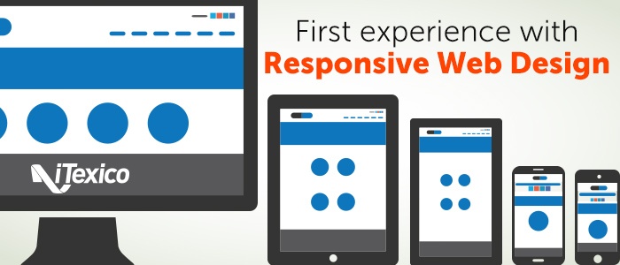
Nowadays it seems mobile devices have entered our life in almost every aspect, from our daily chores to our office, and sometimes they are even taking roles that computers used to have. These reasons show us that companies have to take seriously the age of mobile content and what it means to provide to your users the ability to not only show them what they need from your business throughout the internet, but to allow them to access these contents from anywhere and any device they choose. One of the great solutions for this challenge, in web development, is what is known as Responsive Web Design.
What is Responsive Web Design?
In a nutshell, it's giving your website the ability to resize and adapt to any screen size in any device that we may encounter, from big desktop screens to the smallest mobile device. This means that the content of your website needs to move, adjust and sometimes even resize to the needs of the device.
When talking about Responsive Web Design, we need to touch subjects such as HTML5 and CSS3 (tools that are also used in mobile development), we need to talk about some amazing technologies that may not be new such as JavaScript and start exploring new concepts in web design such as device screen size, in other words, we need to start worrying about the size of the devices that exists now and will likely exists in the future.
Today, we can see many examples of these techniques in many sites throughout the internet. You may wonder the same way I did when I first needed to apply Responsive Web Design, how can I achieve this? The one thing you must learn above all (and rapidly becoming the standard) is using Media Queries which are one of the foundation technologies used for Responsive Web Design.
Media Queries
Media Queries are part of CSS3 and it’s the magic behind the resizing and adapting of your website. They focus on giving your site a profile, it means that when your site is viewed through a certain screen size, Media Queries react to that size and apply the profile that you gave to that screen size.
Now straight to the point; basically it all comes down to this:
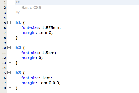
-Your regular CSS
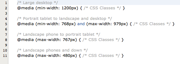
-Example of Media Queries
These previous examples show you what Media Queries look like and some examples of some of the most commonly used Screen Sizes used in by the Web community (according to all the documentation I've read and comparisons made through different tutorials and books), of course they can vary and of course you can adapt these to your specific needs, this example intents to show you how you can start building them.
One of the most common questions I've seen is: Do I need to create CSS for each resolution? The short answer is yes, but don't let that discourage you, you may need to build some classes specific for each resolution, but there will always be CSS classes that won't change throughout the site, those can be left out of the media queries.
Remember that the whole idea of a good Responsive Web Design is to have a unique HTML document that can adapt with CSS to all needs.
Front-End Frameworks
Now that we've briefly talked about Responsive Web Design, we can discuss about the tools that can help you along the way. These tools make your life easier in many ways and will help you focus on more specific things regarding your site, such as which resolutions to add to the media queries, rather than “how can I build the basic layout?”.
One name you can use to find these web development tools is a “Front-End Framework”, and they will help you build a layout much easier and some of them will even not only support but encourage Responsiveness.
My personal recommendation is Bootstrap, which is a Framework that is updated regularly and has some amazing features.
Remember that Responsive Web Design despite being relatively new (it all started with the proposal and description of them in 2008 with the boom of mobile development). It's a powerful technology that should not be overlooked, since we are in an age of information and mobile devices. These tools will help you not only to catch up but to provide a much needed service to your customers.


Post Your Comment Here