
The Importance of Typography in UIUX Design
The desire for uniqueness can be easily misconstrued and morphed into a warped rendition of your original vision. Anyone can create a bread and butter website, and while it may serve its function well enough, the final product may not leave an impact on the user as you’d like it to. Pursuing that final look, whether it be original, exotic, or attention-grabbing, is a result descending from… a certain overzealousness for “the look”, and winds up with the essential elements of a well designed page neglected or, perhaps, overextended.
Let’s talk about typography. Typography is the style and appearance that the printed word will take on your page, including different fonts, sizes, placement, and so on. Typography has always been an important part of design, but it’s unappreciated in its function. Like tomatoes in your risotto recipe, while every other facet of your site may blend well, it tends to fall apart without the key ingredient.
Being so overlooked, the typography in your website remains a very neglected feature when the design process is put into practice. When compared with elements such as the coding process or the framework design, typography is easily sentenced to the backseat and forgotten about. This can be fatal. It’s important to remember that typography transforms and brings to life what we’re trying to represent graphically.
For instance:
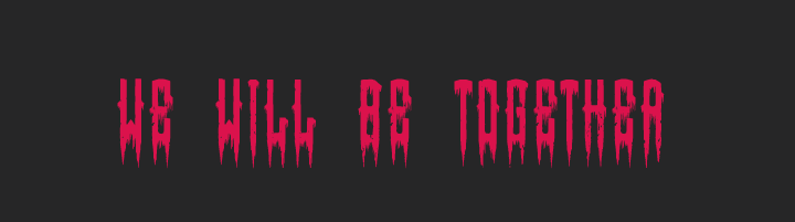
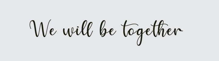
One of these would be great as a header for your up and coming death metal band, Dethpokalypse, advertising its next live performance next Thursday. The other, well, not so much. As you can see, the same phrase has been used, but its context and intention have been transformed through different typography styles.
Typography is about more than legibility and aesthetics. It’s the opening salvo for introducing your product or site, as well as subtly (and perhaps not so subtly) influencing how your audience perceives it. Portraying the intended message in a correct way is just as important as how it impacts your aesthetic and legibility. Although it may sound cheesy, show what you wanna say without words.
Typefaces
It’s tempting to go off the rail and wildly experiment with typefaces. It can actually be a lot of fun, but you don’t want to wander too far off the beaten path, because there are bandits out there who are going to beat you, take your wallet, and leave you high and dry with no user base because none of them want to deal with your poorly chosen typeface.
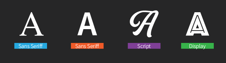
There are, functionally, four typefaces that are commonly accepted as safe bets for usage in the design process. These top four candidates represent the best options for clearly articulated content while remaining professional and appealing to the eye. To deeply understand the role typography plays during user experience, we must know basic typefaces, which may be subjective at times, but most authors agree on the following categories:
Serif
Serif is a formal typeface, a classic option that exudes legibility and professionalism. It includes a small decorative line added as embellishment to the basic form of a character, which aids in giving your content a sense of continuity and helps with legibility.
Sans Serif
Literally translated to “without Serif”, this typeface bears origins in the XIX century. As you may notice, it lacks the distinctive bottom line that Serif bears for fluidity, opting for a more bold style. As a result, Sans Serif is more symmetrical, focusing on straightness and well defined axes.
Script
The physical act of handwriting is in itself a unique template that every literate person on Earth has some familiarity with. The Script typeface aims to exemplify and portray that form digitally, reflecting it with a fluid and continuous stroke. Compared to the other typefaces, this is a very stylized option.
Display
The Display typeface breaks the most from the rest of the other three typefaces, prioritizing an eccentric, carefree nature. Rather than subject its standards purely to fluidity, stylization, or straight design, the Display typeface isn’t governed by any norms, and instead tends to be playful. It’s not the kind of typeface you’d use for long body text passages, rather it’s intended for headings or large size titles. Examples of how Display may be used include headings to horror movies or even the typical ransom letters villains make with magazine cutouts.
Why is Typography Important in Web Design
Let’s dive deeper into the ocean of typography and discuss how the role portrayed by its presence affects the outcome of good UIUX design. Although UIUX does not work the same way as mainstream communication methods, it’s important to remember the basics. The user is exposed to what we want to communicate through means further than simple tooltips: they’re influenced by colors, shapes, buttons, interactions, and typography, obviously.
Essentially, every facet of your website design choices will have an effect on how the user perceives it and, by extension, your company. To illustrate our point, let’s work through a small exercise to better explain appropriate application of typography and style.
In the following image we have three typefaces, with each one representing a different application. The challenge consists of assigning each application to a different concept: News, Cooking, and Toys.
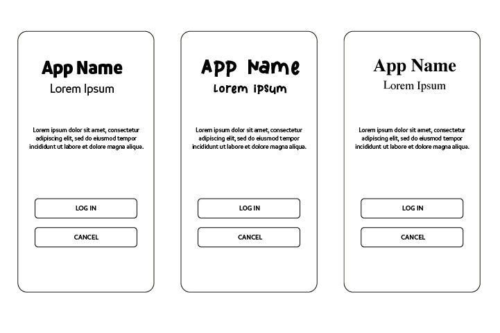
The correct assignment of topic to typeface is as follows:
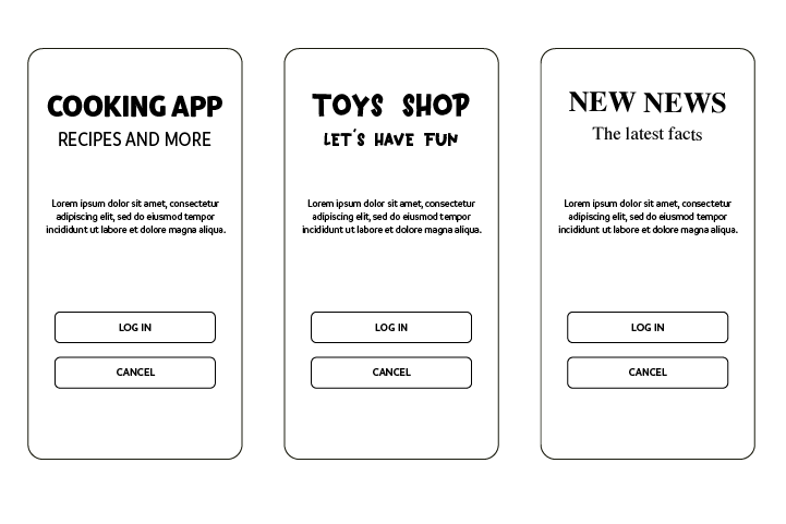
You don’t exactly have to be a UIUX engineer to get a basic grasp on why these typefaces work particularly well for the topics they’re covering. Chances are most of your target audience won’t even realize it themselves, they simply know. How our brains receive and translate typeface, stylization, and content is an assorted mess that doesn’t require an educated understanding to know why something just doesn’t quite work.
For the cooking app, Sans Serif is used. It’s visually pleasant and soft, providing a sense of calmness while still remaining casual. Cooking apps tend to not need emphasis on the vital importance of their content, considering they’re mostly instructional and educational for building positive habits and skills. The approachable Sans Serif typeface is perfect for it.
For the second app, toys, we’re going for am out of phase look. It’s asymmetrical, crooked, and exudes an almost chaotic sense while remaining legible. This is to help represent a child’s writing, directly appealing to the target audience on a personal level. It portrays a carefree feeling, like playing while learning to handwrite. With the majority of the app’s contents catering to kids, the typeface helps bridge the initial gap and pull in its user base.
Finally, the third app: news. We have a Serif font, which gives a sense of sobriety, with finishes that aid our vision in continuing reading with a quick flow. That formality makes a connection to news outlets, which is what the user looks for when reading that type of content: reliability and formality. Since news is a serious product to sell, it needs to appeal to its audience as a reliable, confident source of information.
To wrap up this exercise, I’d like to highlight how body text typography is the same for the three applications, a situation that must be taken into consideration regarding consumption of information, where we must avoid for the user to feel visually saturated. The more stylized large text paragraph content is, the more strained the eyes become in reading it. Essentially, you don’t want your audience feeling like interacting with your typeface is a chore.
Top Things to Consider When Selecting Fonts for your Design
You’re not going to find a handbook laying out, in excruciating detail, every step and formula for optimizing your UIUX design. While the written science behind optimal typography use doesn’t exist, we do have some useful tips that may come in handy during your UIUX design process.
Less Is More
The more you add into your pool of typography, the more cluttered, disorganized, and distracting it will become. With every included typeface you use, with every unique header and adjusted line, the more difficult it becomes to synergize the design as a whole into a cohesive, legible product. The best approach is to minimize your selections. Working with the least amount of typography variation provides a cleaner, more effective look for the app as a whole.
Make It Simple
Simplicity is the number one attribute you should aim for during the design process. Not only should you focus on minimal variation with the different fonts you’ll be using, you also need a streamlined experience. Any extraneous elements that aren’t necessary to the sole function and purpose of the app should be removed. A clean design equals effective design. A good user experience is closely related to element distribution within an app. Grab a broom and get to spring cleaning.
Think About the User: Who Are They?
Your target audience needs to be at the forefront of your design process. Everything finalized should cater to their unique interests, preferences, and necessities. For instance, if you’re catering to senior citizens, it’s a good idea to choose legible and big typefaces. The older generations have worse eyesight than younger ones, so offsetting poor vision with large characters makes it easier and more enjoyable to use your app.
If you’re catering to children on the other hand, Display typefaces are your best bet. Kids are a vibrant crowd, and if you’re going to capture and keep their attention, bringing in a typeface that prioritizes creativity, vibrance, and eccentricity is ideal for the younger crowd.
You’ll need to have a good idea of who your target audience is, to start with, as well as pairing your chosen typography with your content. Is your product more on the formal side? Serif will be your best choice. Is it education, relaxed, and intended for enjoyment rather than raw info? Sans Serif might be what you’re looking for. Typography selection is directly related to your target market.
Legibility Vs. Style
The eternal dilemma with design.
You want to build a design that’s unique and differentiates itself from your competitors. You want to explore your creativity, spread your wings, take a few risks, and make something daring that works. However, you need to be able to do all of this while retaining legibility for the final product, ensuring that the entirety of the product isn’t a shack held together by rusty nails and glue. It needs to function as well as it looks, and that it looks as good as you think it does to the audience.
The best approach for this situation is to think about the user, meaning you may not have the luxury of cobbling together an interesting but risky app design. However, if you happen to have the time and resources to do A/B testing, it’s definitely worth considering. Take your product to the people before it’s finalized, get feedback, opinions, and determine whether you have the space and freedom to stylize your app. Get experiment and give your final product a big added value.
Conclusion
Sometimes it’s not super necessary to be overly specific across all our interactions. Given the right design, the right framework, the right typeface, then what the user sees can transcend beyond words. If we as designers work on creating the right environment and accentualize transmitting that experience through the use of fonts, we can deliver more information with less words. People thrive on visuals, and the more the eyes can translate images as communication, the better the final effect.
Although this can be a tricky process, once it’s mastered, you will make the right typography choices unconsciously. It’s a core tenet of fully comprehending how your choices will impact your audience. As with everything in life, practice makes perfect. You must expand your own limits as a designer on your own terms. The real challenge lies in making the user feel comfortable with your final product.
This is all something that we can help with. We at iTexico employ some of the best minds the IT field has to offer, comprising high quality, effective UIUX design teams. Given our design team capabilities, we’re excited to be able to assist you with developing your own improved design teams, working through strengths and weaknesses alike to provide a final product that you’re happy with.
If you’re interested in our services, please visit us at our contact page for more information.
About The Author
Armando González. Graphic designer since I can remember. I have emotional dyslexia.
Hand-Picked Related Reads For You

UX & UI Design is More Than Just Graphic Design
READ MORE
4 Important Tips for Better Mobile App and Web Design
READ MORE
Creating a Brief Before Starting a Mobile UX Design Project
READ MORE


Post Your Comment Here